Italic script – introduction
After a bit of theoretical knowledge and a few simple exercises, it’s time to tackle the first typeface. It is the Italic script. The name of the script can rightly be associated with Italy, as it was there in the mid-16th century that this typeface flourished the most, later spreading to the rest of Europe. The choice of Italic script as the first typeface for calligraphy is no accident. It is relatively easy to learn and yet very elegant. It also gives a lot of room for interpretation.
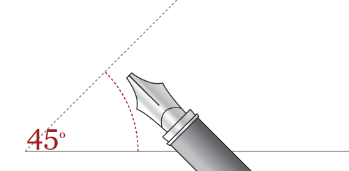
The examples presented below have been adapted to practice with a pen. If you only have a marker or stick, the individual strokes may look slightly different (there are usually fewer of them). When writing in italics, the pen should be between 40º and 45º. With some letters, however, you may need to change the angle of the pen. The slant of letters in italic is (on average) 5º, so it is slanted.

Size, proportions and spacing
The height of the minuscule letters in italics (x-height) is 5 times the width of the nib. Ascenders and descenders are 3-4 nib widths long. This is where our calligraphy practice sheet generator, Calidraw, comes in handy. In addition to italika, it can create sheets for virtually any other typeface. By knowing the width of your nib (nib), you can generate and print an individual italika practice sheet. This is great for those taking their first steps, but we encourage you in the long run to make such a worksheet yourself. Lines drawn in pencil can always be erased – printed lines cannot.
The spacing between pairs of letters (kerning, light) varies and can be summarised as follows; the largest spacing is between letters with vertical dashes and sticks (e.g. li, hi, kl). Medium spacing if next to each other occurs a letter with a vertical dash and a rounded part(e.g. is, le, js). Smallest spacing is between two letters with rounded parts (e.g. bo, od, oc, pc). The spacing between whole words should be approximately the width of a small “x”. Of course, these are not rigid and universal rules! Over time you will come across the term ligature, which is an exception to the rules described above. The overriding rule for spacing is that both a single word and a block of text should look coherent and have no unnecessary ‘holes‘.
Family-like letters
The individual letters in italics can be categorised by the way they are written. One then speaks of a family of letters one also encounters a group of letters. For example, the small letters “o”, “c” and “e” differ by only one stroke, “a”, “d”, “g” and “q” have their bellies to one side. Grouped letters are easier to learn in this way and this is the system I have used in the following examples.
Character in characters
It is good to know what the angles, spacing and dimensions should be, but don’t be intimidated by this – much more important is the overall rhythm, ductus and consistency of the writing. For it is these factors that make handwriting unique and specific only to its author.
Multiple forms of italic script
A lot of time has passed since the 16th century, so necessarily there are now many varieties and types of italic script. Many interpretations of the italic can be found among today’s computer fonts.
« Size, spacing and proportionsItalic – small letters (minuscules) »


Recent Comments